- INICIO
-
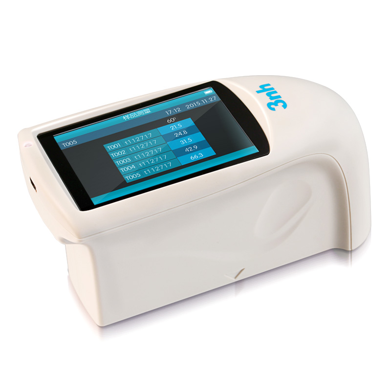
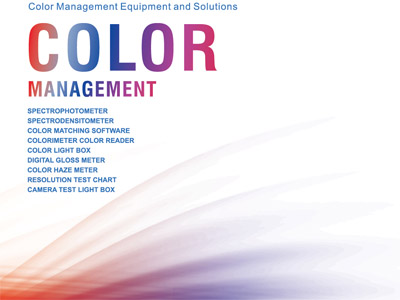
Instrumentos principales
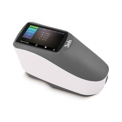
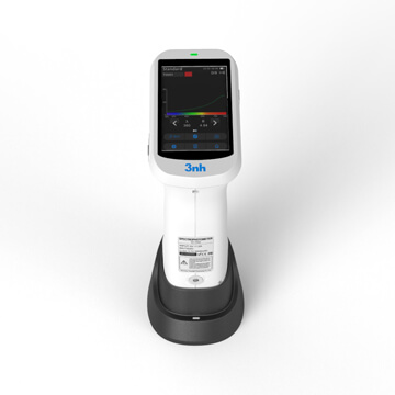
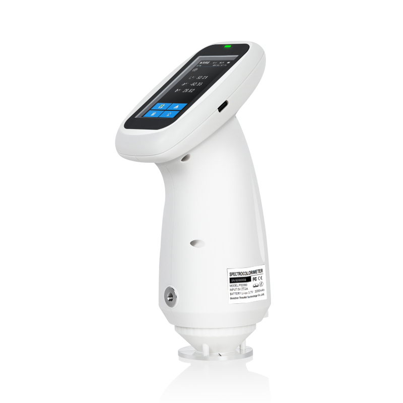
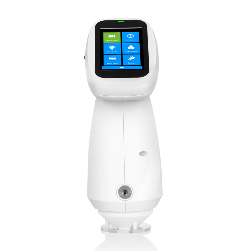
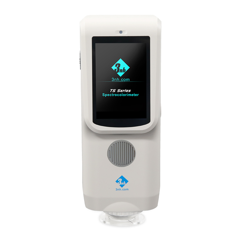
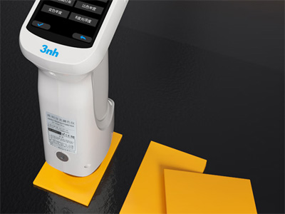
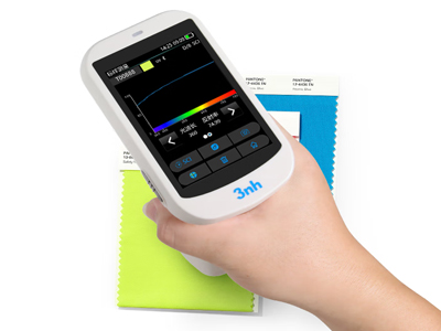
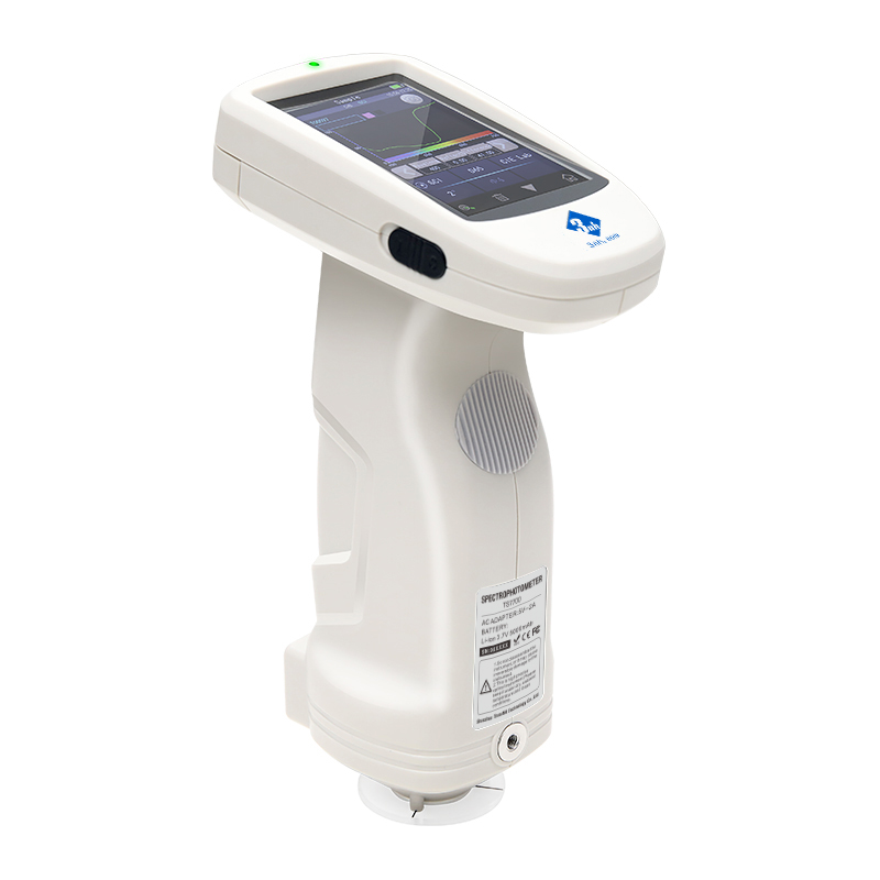
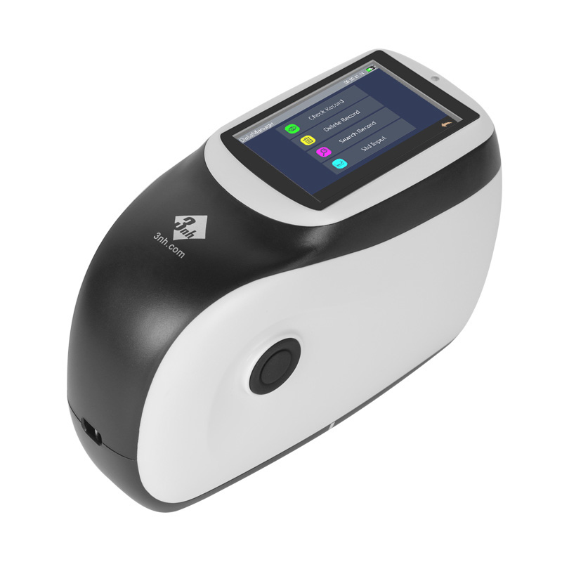
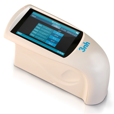
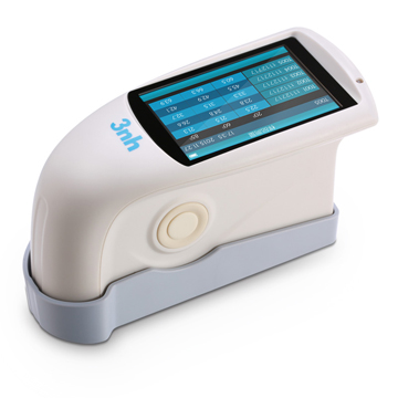
Espectrofotómetro de rejilla TS7700
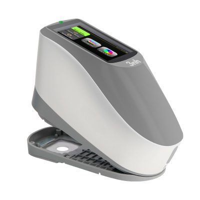
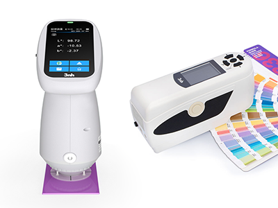
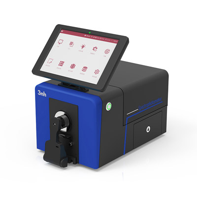
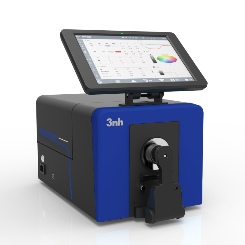
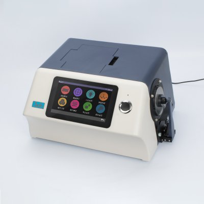
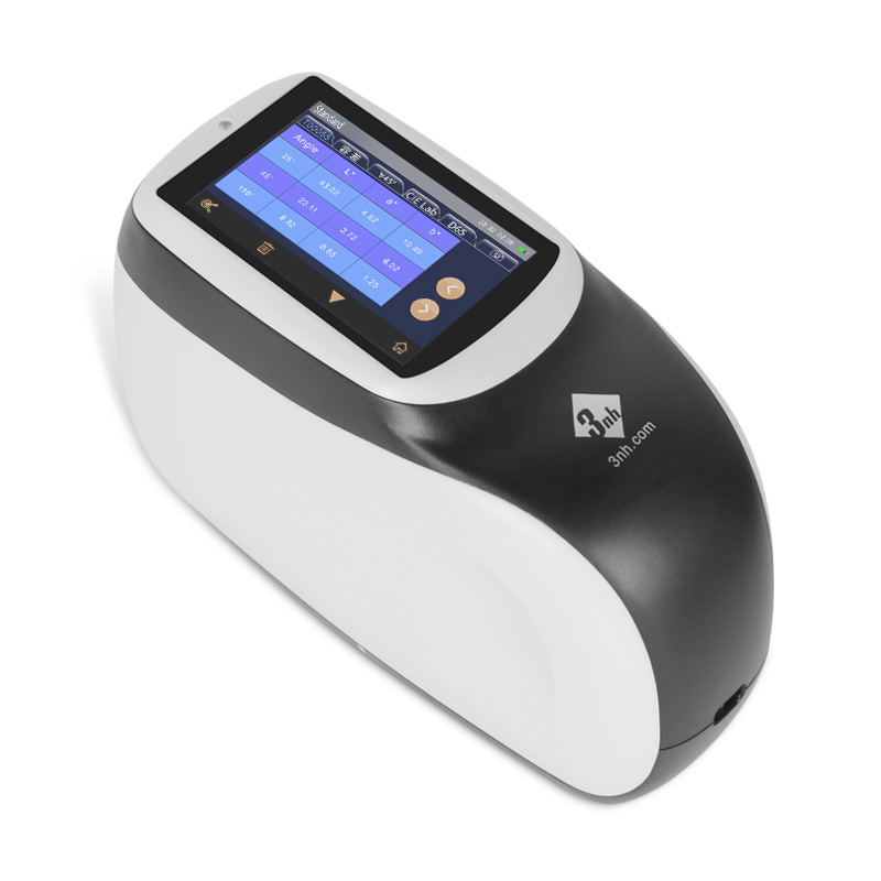
Espectrofotómetro de laboratorio TS8520
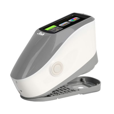
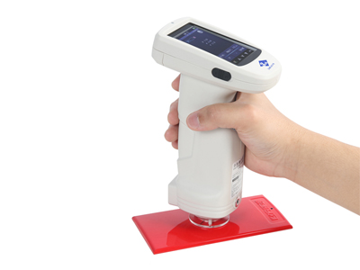
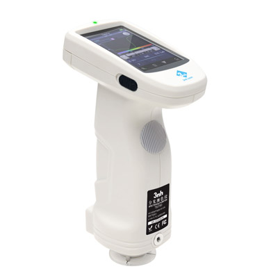
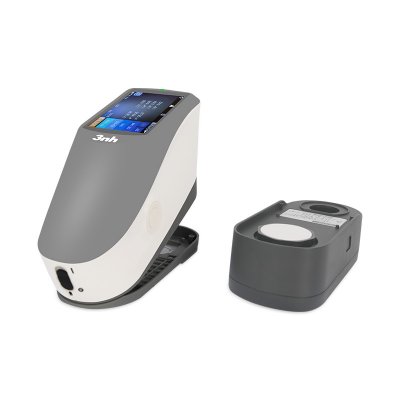
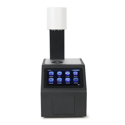
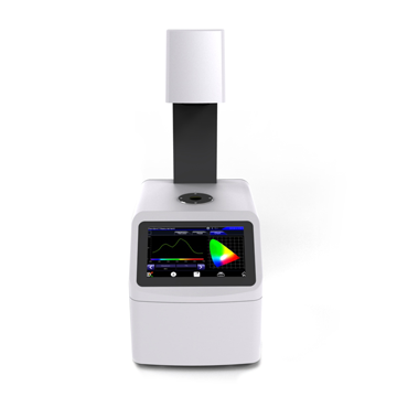
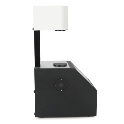
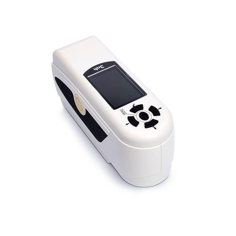
Espectrofotómetro de escritorio portátil TS8450
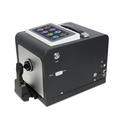
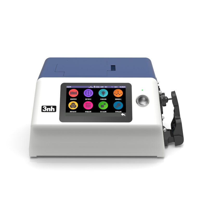
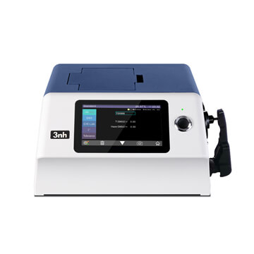
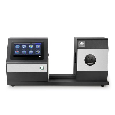
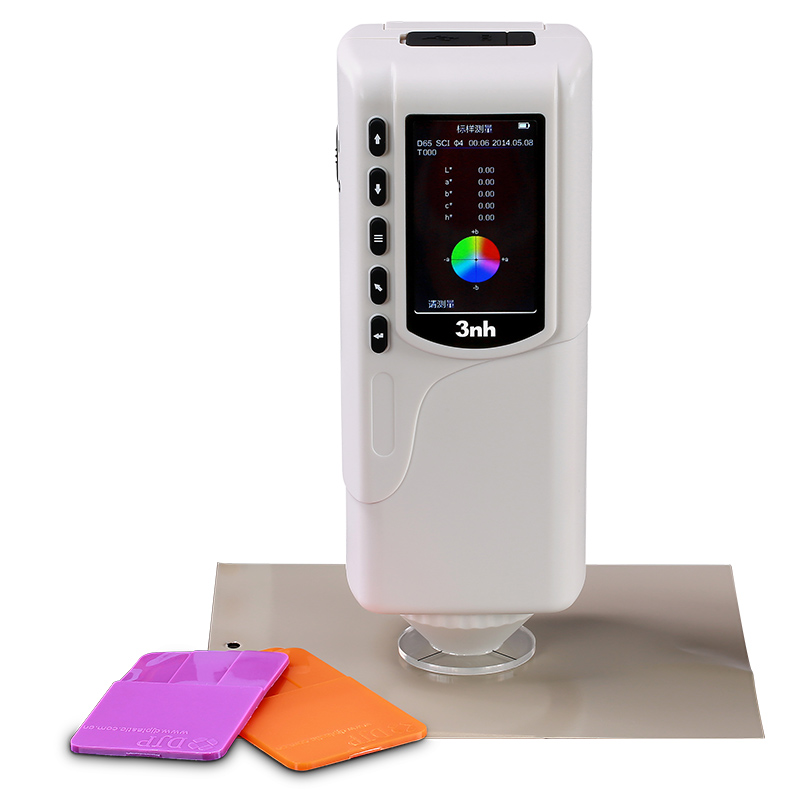
Espectrofotómetro de banco YS6060

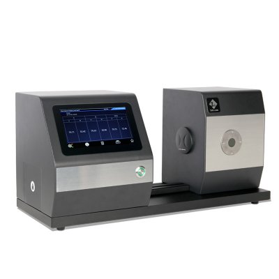
YS6002-M Medidor de niebla de color de banco
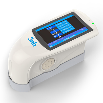
Medidor de niebla de color YH1610


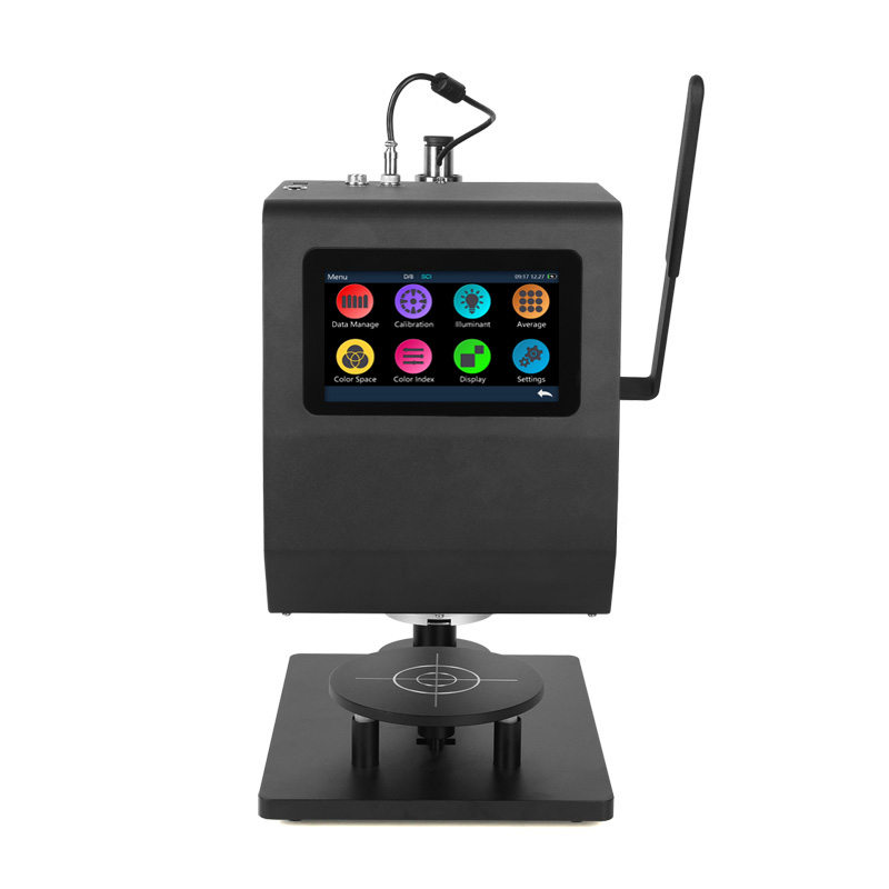
MS3012 Espectrofotómetro multiángulo
Espectrofotómetro de color de 8 ángulos MS3008
MS3006 Espectrofotómetro multiángulo

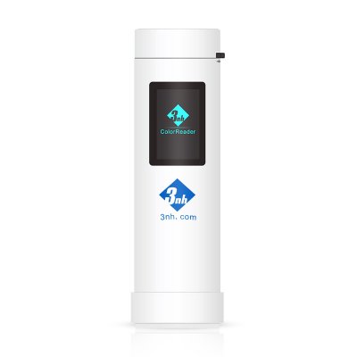
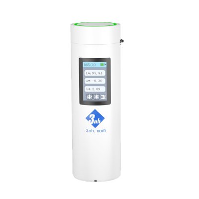
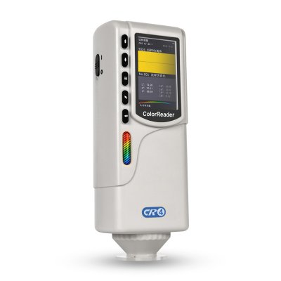
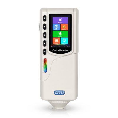
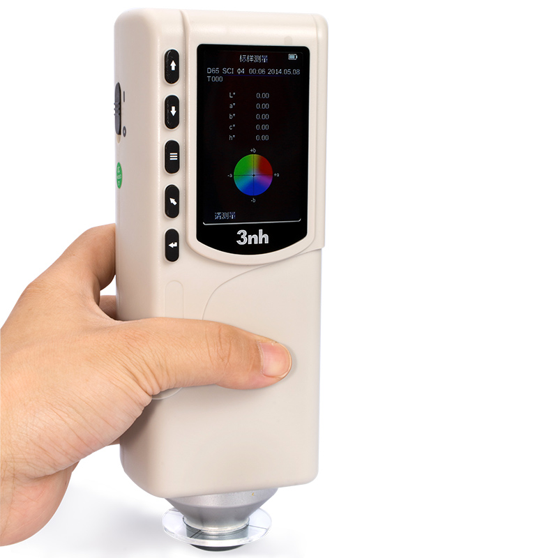
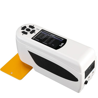
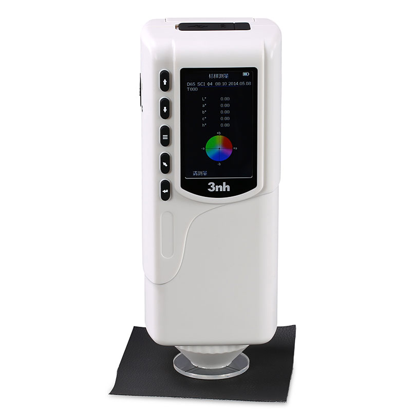
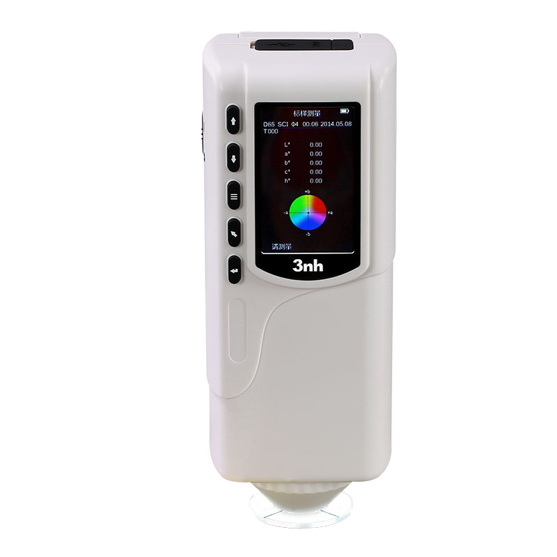
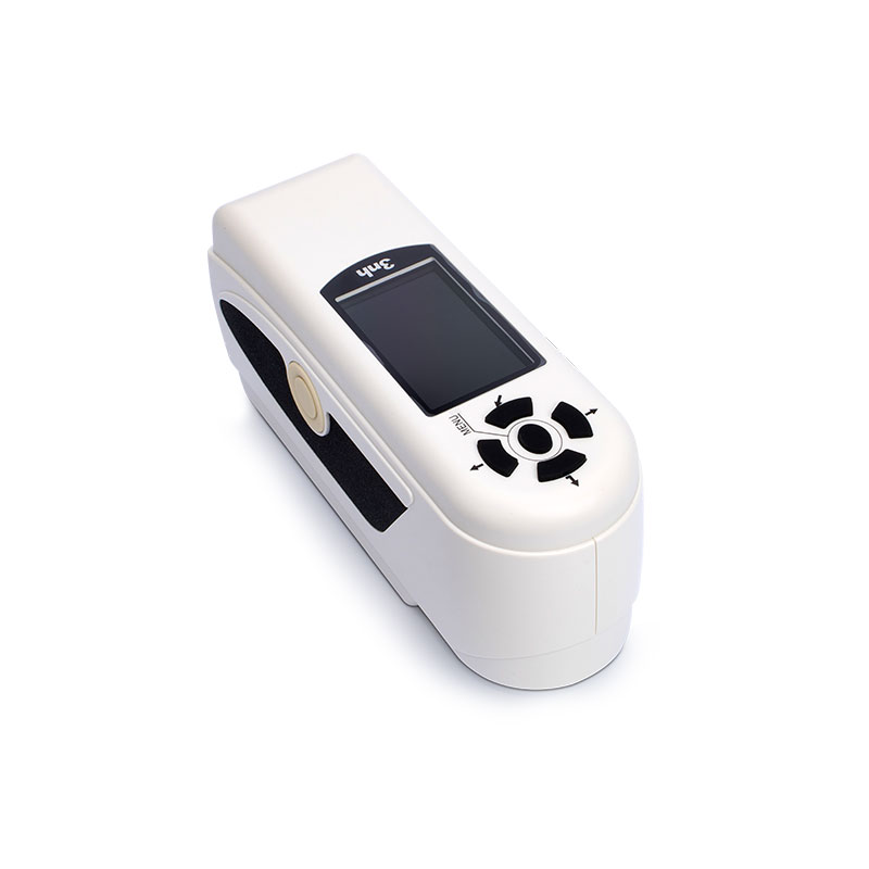
Colorímetro de precisión NR20XE
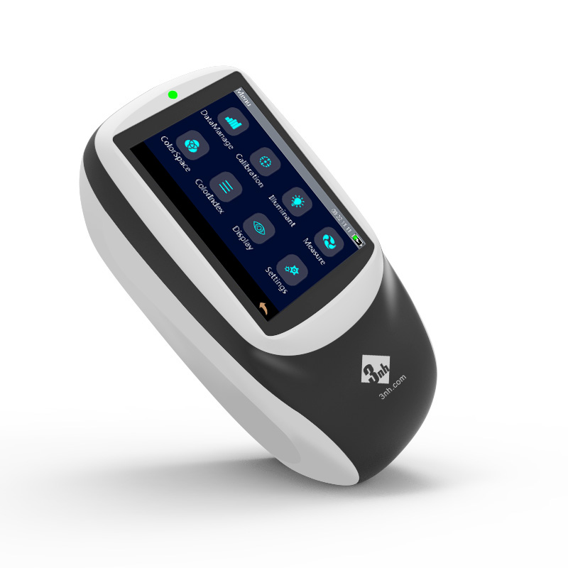
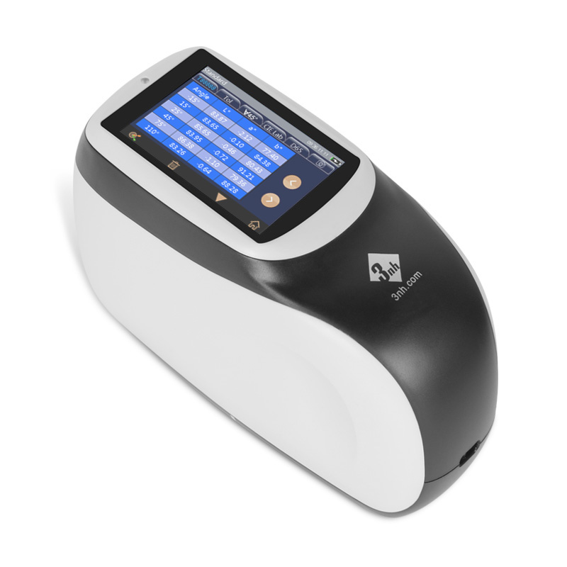
Colorímetro de precisión NR200
Colorímetro de precisión NR110
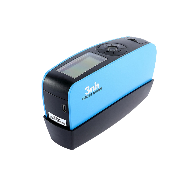
Medidor de brillo horizontal NHG268
Medidor de brillo sin contacto YG60L
Medidor de brillo triángulo HG268
Medidor de brillo de apertura pequeña NHG60M
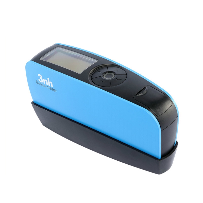
YG60S 60 ° Medidor de brillo económico


Cabina de luz de color americano M60
Caja de luz de color británico T60B
CC120-W Visor de cabina de luz colgante
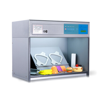
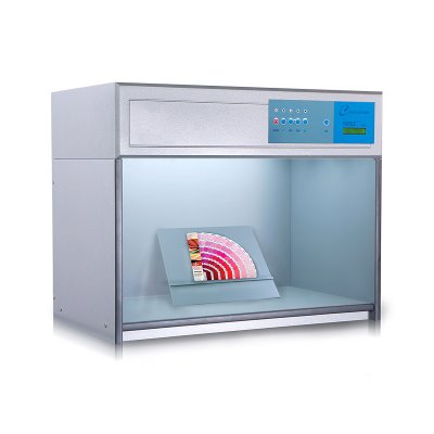
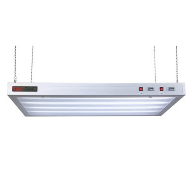
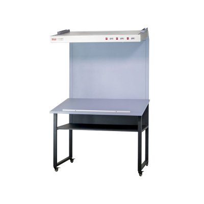
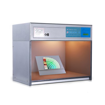
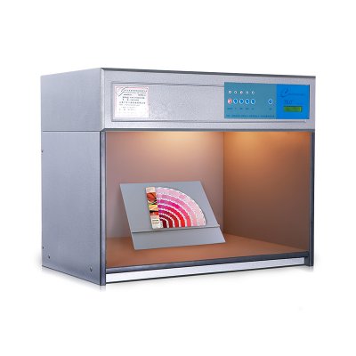
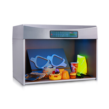
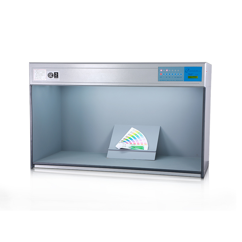
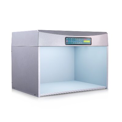
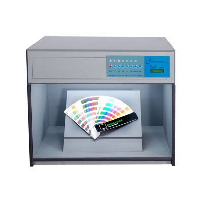
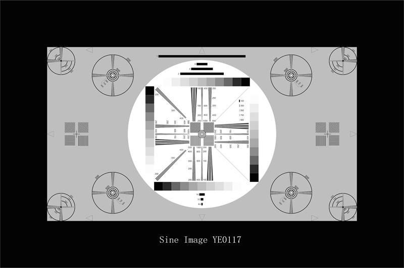
Gráfico de prueba universal de HDTV
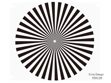
Gráfico de prueba de estrellas del sector (36 ciclos)
Gráfico de prueba de estrellas del sector (72 ciclos)
Gráfico de prueba de equilibrio de blancos
Gráfico de prueba de medición de estrías
Tabla de prueba de barras (IEC 61146)
-
Solución innovadora
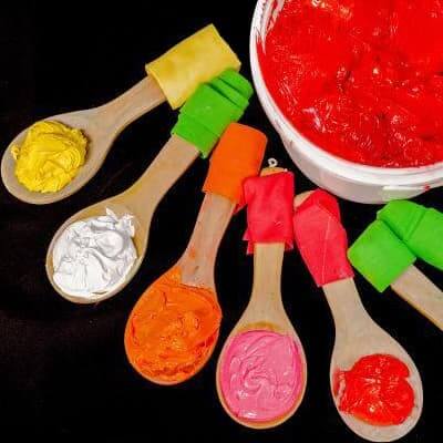
En el proceso de producción textil, la consistencia del color es compleja y fácilmente afectada por una variedad de factores, y las pruebas y la gestión del color son el núcleo para garantizar la calidad y la consistencia del producto.
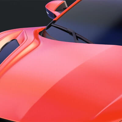
En la fabricación de automóviles y piezas de automóviles, la consistencia y la precisión del color son críticas porque afectan directamente a la apariencia del vehículo, la imagen de marca y la satisfacción del cliente.
En la industria de los plásticos, la medición del color es crucial, principalmente para garantizar la consistencia del producto, mantener la imagen de la marca, fortalecer el control de calidad y mejorar la satisfacción del cliente.

La gestión del color en los recubrimientos es clave para mantener la calidad del producto y la competitividad en el mercado.
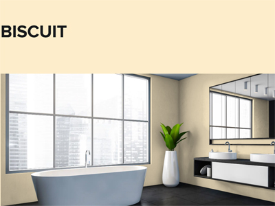
Asegurar el color preciso en las soluciones de materiales de construcción; La gestión del color en la industria de materiales de construcción y decorativos es crucial para garantizar el atractivo estético, la consistencia y la competitividad del mercado de los productos.
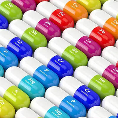
La gestión del color de los materiales médicos es clave para garantizar la funcionalidad y seguridad del producto.
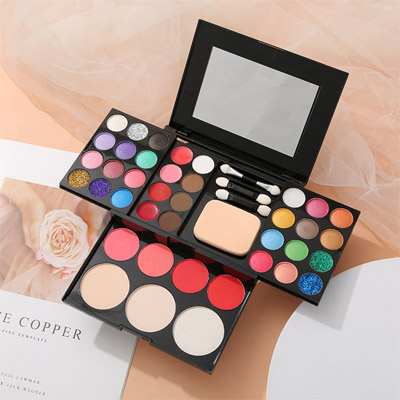
En la industria cosmética, las pruebas de color son clave para garantizar la calidad del producto y la imagen de la marca, y es crítica para el desarrollo del producto y el rendimiento del mercado. 3nh Proporciona Servicios En la medición de color cosmético, líder de China en gestión, medición y control del color, ofrece espectrofotómetros cosméticos, densómetros, colorimetros y software de medición del color.
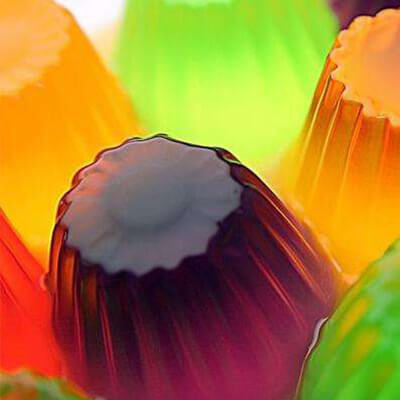
Las pruebas de color desempeñan un papel clave en la industria de productos y alimentos porque el color no solo afecta la apariencia y el atractivo de un producto, sino que también refleja su calidad y frescura.
La importancia de la gestión en la industria del envasado, la impresión y los productos de papel se refleja en varias áreas clave. 3nh es el líder de China en gestión de color, medición y control, ofrece espectrofotómetros de impresión, densímetros, colorimetros y software de medición de color.

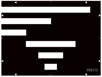
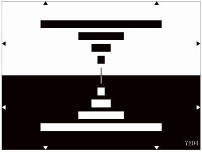
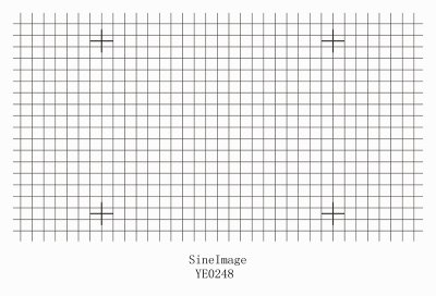
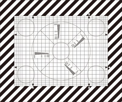
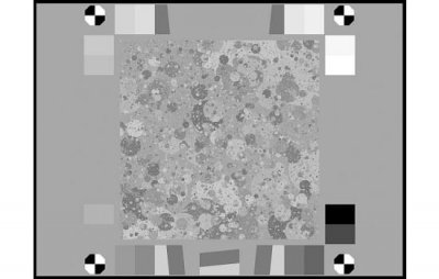
Soluciones de laboratorio de prueba de imagen, el laboratorio de prueba de imagen personalizado de Sine Image está equipado con cajas de luz de prueba de ángulo amplio, 7 conjuntos de cajas de luz de prueba de temperatura de color fija, varios gráficos de prueba (como gráficos de prueba de tono de piel, gráficos de prueba de resolución, gráficos de prueba de distorsión, gráficos de prueba subjetivos de escena real, etc.), portadores de gráficos, luces de llenado y otros equipos. Sus soluciones y productos de prueba son ampliamente utilizados en industrias como monitoreo de seguridad, imágenes automotrices, fotografía, imágenes médicas, televisiones y computadoras, teléfonos móviles y drones para la inspección de calidad de imagen.

-
Service & Support
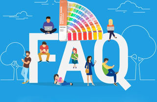
Preguntas frecuentes sobre Apariencia e instrumentos de medición de color, En esta página encontrará algunas preguntas frecuentes que son relevantes para la gran mayoría de nuestros equipos de instrumentos de medición. ¿Tiene alguna pregunta sobre los productos de Threenh?
Catálogos, folletos, folletos, certificados, información técnica y más; Cualquier requisito de documento por favor descargue aquí para lograr una buena comprensión para el espectrofotómetro de color, medidor de brillo, productos de gabinete de evaluación de color, Threenh Technology es una compañía de instrumentos de precisión dedicada a la investigación y el desarrollo, la producción, las ventas y los servicios técnicos.
IQstest es un software de prueba de imagen desarrollado por la compañía SINE IMAGE de 3nh, tiene muchos años de experiencia en la inspección de imágenes, soportando gráficos de resolución, gráficos completos, gráficos de rango dinámico, gráficos de pasos grises, gráficos de distorsión, colorchecker, blanco, gráficos de equilibrio, gráficos de fov, gráficos personalizados.

PeColor Color software de coincidencia, enfocando en la solución de color general, Un espectrofotómetro + PeColor, ¡Hacer coincidencia de color tan fácil!
Threenh le ofrece servicio posventa de calidad. ¿Necesita solucionar problemas, reparaciones o un contrato de mantenimiento? ¡Contacta con nuestros equipos! 3NH Términos de garantía; Guangdong Threenh Technology Co., Ltd. (en adelante "3NH") ofrece un período limitado de servicio de garantía a los clientes (en adelante "cliente") que han comprado productos fabricados por 3NH (en adelante "Producto") de acuerdo con los términos de esta Política de Garantía (en adelante "3NH").

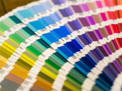
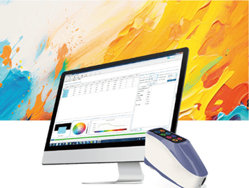
3nh ofrece una variedad de soluciones de software de control de calidad de color. A continuación se presentan algunos programas de software comunes y su información relevante: Aquí está la introducción al software de control de calidad de 3nh

Equipe a su equipo con dispositivos de corlorímetro y espectrofotómetro de alto rendimiento y asequibles personalizados para su negocio único. Según la demanda del cliente para proporcionar diseño y servicios ODM personalizados, ayudando a los clientes a mejorar la ventaja competitiva de su marca. ¡Ordene a granel y ahorre!
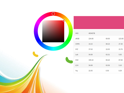
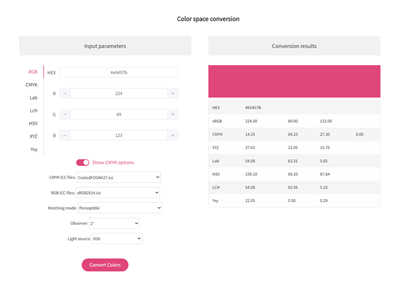
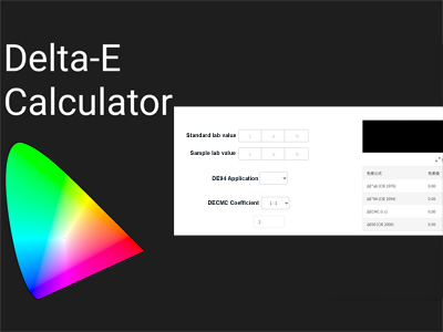
Incluye la conversión de los valores CIE Lab del color estándar y el color de la muestra. Esta herramienta le permite encontrar la diferencia de color correcta agregando números a la fórmula CIEDE2000 (CIE 2000) después de introducir estos valores.
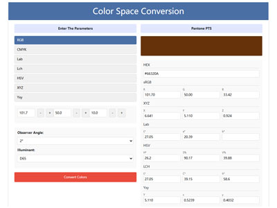
Convertidor de color, RGB CMYK HEX Lab Lch HSV XYZ Conversión de un clic, Herramientas profesionales de espacio de color, Convertir fácilmente RGB CMYK HEX Lab Lch HSV XYZ a Pantone (PMS) - Prueba nuestra herramienta, conversión precisa y sencilla de espacio de color con nuestro convertidor
-
Resources
3NH Company News Center, Noticias y eventos, Desarrollos emocionantes, nuestro centro de noticias sirve como un centro dinámico de los últimos acontecimientos y desarrollos dentro de la empresa y la industria en la que prosperamos. Líder de Gestión de Color 3NH Las Últimas Noticias

Las Últimas Noticias de Producto de los Líderes en Gestión de Color, ¡Manténgase al día con todas las últimas noticias de Threenh! Descubre nuestras últimas innovaciones, anuncios de reclutamiento, nuevos productos, comunicados de prensa y mucho más.

Descubre las últimas noticias tecnológicas y productos de medición de threenh technology. Compre soluciones tecnológicas innovadoras o instrumentos de medición para su negocio ahora! No importa lo que quieras medir, hemos hecho las bases para ayudarte a encontrar la herramienta de medición de color adecuada.
Obtén el conocimiento básico del color con la tecnología de threenh. Explore soluciones inteligentes para sus necesidades empresariales. ¡Contáctenos hoy mismo! Aquí es donde encontrarás los próximos eventos de tecnología de color y startups en todo el mundo.
Obtén el conocimiento básico del color con la tecnología de threenh. Explore soluciones inteligentes para sus necesidades empresariales. ¡Contáctenos hoy mismo! Aquí es donde encontrarás los próximos eventos de tecnología de color y startups en todo el mundo.
¿Qué es la transmitancia
¿Qué hace la resistencia al color
¿Qué es el metamerismo?
Color de Gardner
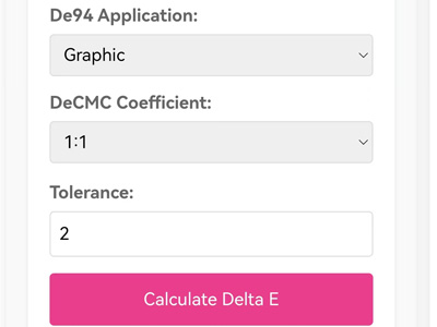
¿Qué es Delta E?
3NH Industry News Center, Noticias y eventos, Desarrollos emocionantes, nuestro Centro de Noticias sirve como un centro dinámico de los últimos acontecimientos y desarrollos dentro de la industria en la que prosperamos.

-
Acerca de Threenh
Embarque en un viaje virtual a través de nuestras instalaciones de fabricación de última generación. Ser testigo de la precisión y eficiencia de nuestras líneas de producción a medida que dan vida a nuestras instrumentaciones de alta calidad y otros productos avanzados.

Proporcionar soluciones a diferentes mercados mediante la entrega de una gama completa de productos de instrumentos de medición y servicios ODM a nuestros clientes. Desde el meticuloso suministro de materiales hasta el montaje preciso y las estrictas inspecciones de calidad, cada paso se orquesta cuidadosamente para garantizar la eficiencia, la consistencia y el cumplimiento de las normas internacionales.

Nombre de la cuenta: Guangdong ThreeNH Technology Co., Ltd.

-
Contactos
3NH está expandiendo activamente su red de distribuidores internacionales en las industrias del automóvil, textiles y prendas de vestir, impresión y papel, plásticos, pintura y recubrimiento, materiales de construcción, químicos y farmacéuticos, cosméticos, alimentos y agricultura. Estamos buscando socios técnicamente capaces, comprometidos y orientados al crecimiento que quieran construir el éxito a largo plazo juntos.